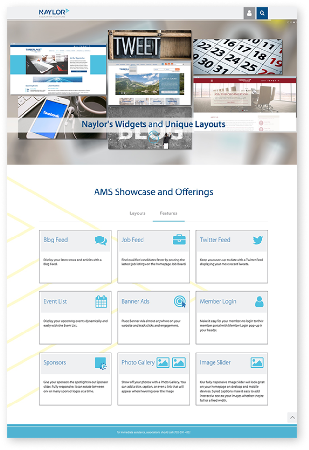
Naylor Website Template

Naylor needed a way to display the new website templates to their clients for easy access and a clear understanding of the type of features we offer with our website services. The best way to do that was to create a website that showcases new designs and offerings. It also guides our clients to make design decisions for their websites.

My Role:

As the senior designer, I was responsible for the website from concept to implementation. Collaborated with my junior designer to decide the interface and functionality of the website.
  • Research
  • Low fidelity designs
  • High fidelity designs
  • Branding
  • Development

Results:

  • Program Manager’s design call with our clients dropped from 2 1/2 hrs. to 1 hr.
  • Multiple design calls reduced by 50%.
  • Website templates were more easily accessible than before.
  • Client's satisfaction changed from 5 to 8 out of 10.

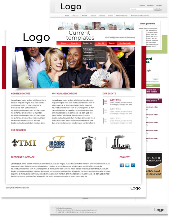
Giving our clients 40 to 45 pages of website templates pdf files was cumbersome and overwhelming. The designs were not modern, and many of the designs looked the same, which doesn’t provide variety. Often these designs caused a lot of mobile issues. The pdf templates were a challenge for our account managers were facing.

image of old website template
user interview vector image

During my user interview, I highlighted some of the account managers' pain points.

Jenny's photo
Name:

Jenny Ramiez

Occupation:

Senior Account Manager

Naylor Clients:

30

Johnny's photo
Name:

Johnny Gaze

Occupation:

Account Manager

Naylor Clients:

20

April's photo
Name:

April Brown

Occupation:

Senior Account Manager

Naylor Clients:

30

Account Manager's Pain Points

  • The client was given 40 to 45 pages of design templates in pdf files.

  • Half of the templates looked alike but had different color schemes and sometimes confused our clients with the number of templates their account manager sent.

  • Clients were not fans of the design presented to them and sometimes brought their design, which can be challenging for our platform.

  • Our account managers were a bit overwhelmed when assisting clients with their website designs.

  • Our account managers were scheduling 3 to 4 design calls with clients, which should have taken two rounds.

My Process

step infography
step infography

Step One

The goal was to create new website templates that are modern and responsive to different screen sizes from mobile to desktop. I collaborated with my junior designer, Julie. Our VP of technology wanted us to create just 10. Julie and I decided to create flexible templates, and our clients can’t mix and match to get varieties.

This process took us 3 to 4 months. I also collaborated with two of my backend developers to ensure that our Association Management System (AMS) could handle the new designs.

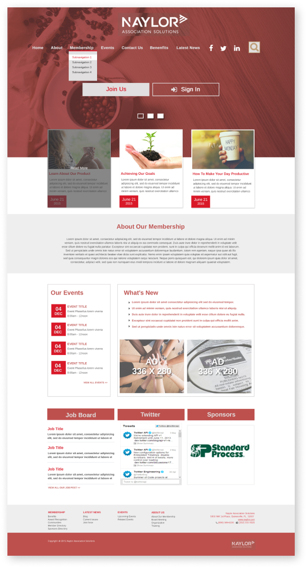
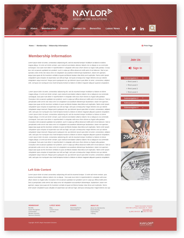
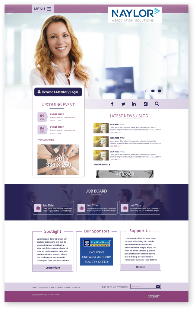
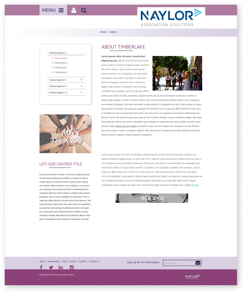
Template Samples

mockup of mobile template

Mobile Layout

mockup of Landing page template

Landing Page

mockup of Subpage template

Subpage

mockup of Landing page template

Landing Page

mockup of Subpage template

Subpage

Step Two

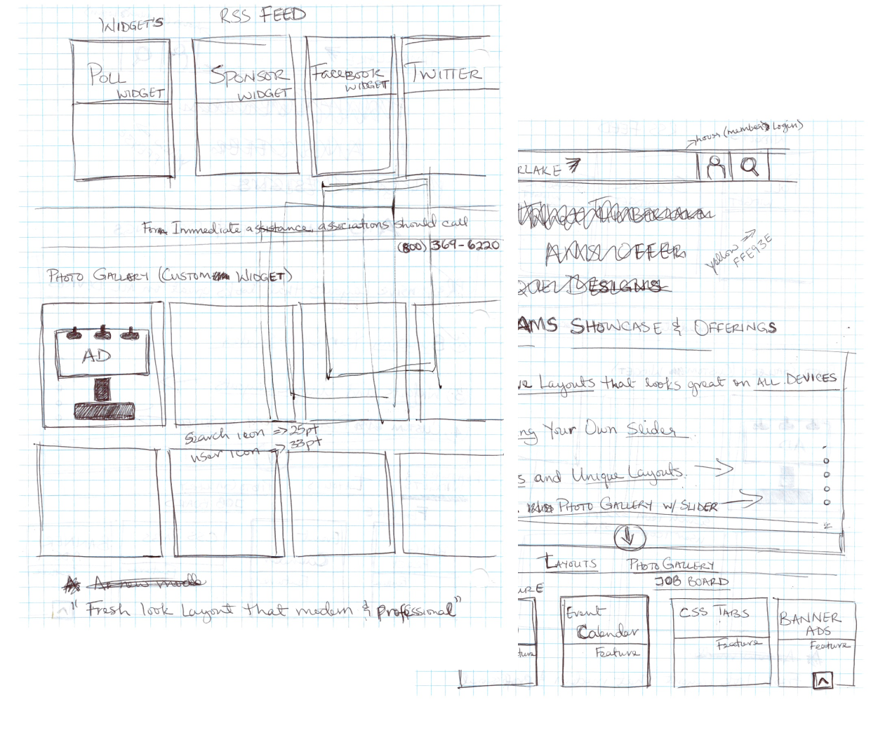
Created a website that houses the new templates for easier access to our clients.

website sketches

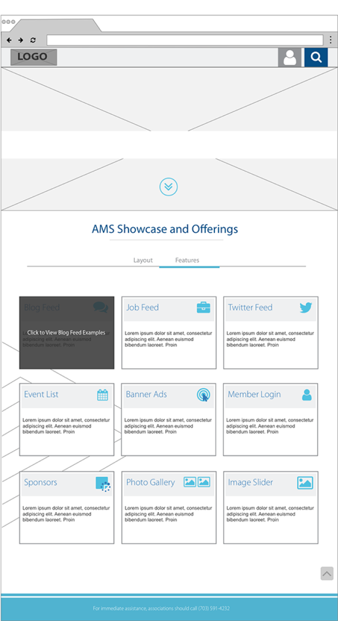
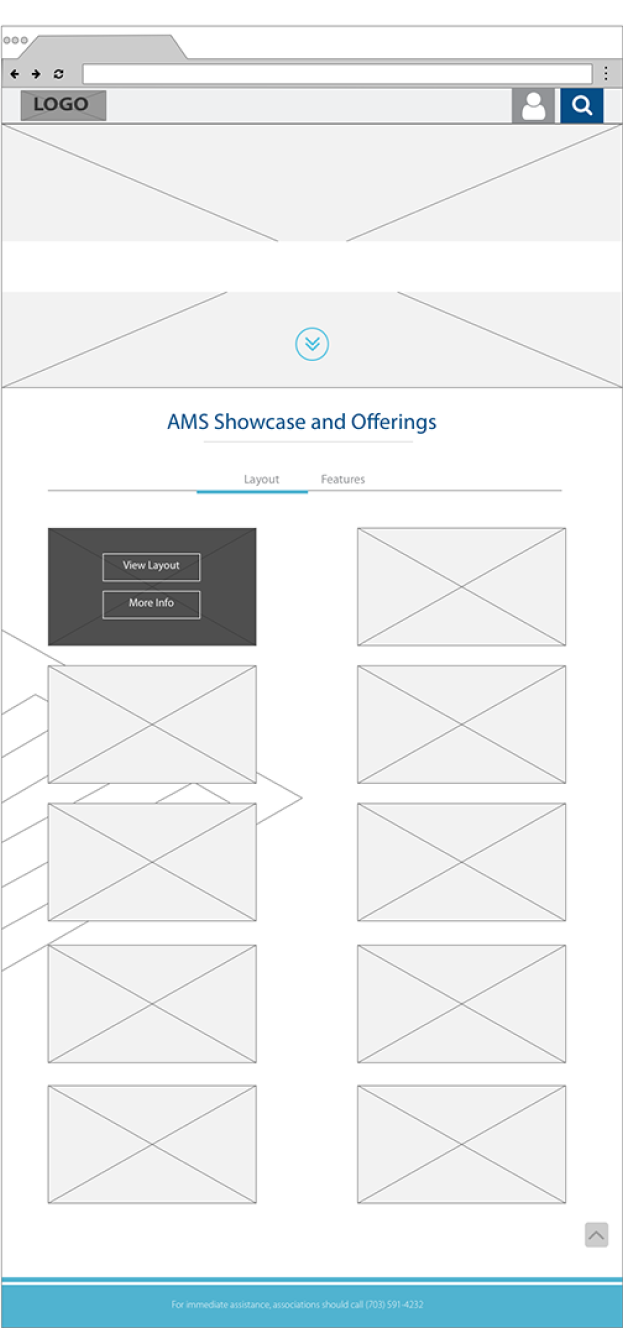
After a few revisions, I created a wireframe to show the final designs.

website wireframe
website wireframe

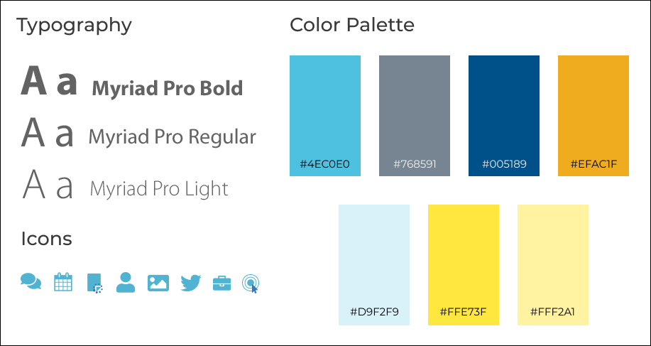
Style guide using Naylor’s branding

website style guide

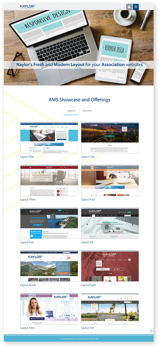
Implemented design

final website mockup