

This is an independent case study for my UX Certification. I collaborated with a mentor.
Some parents feel like summertime is somewhat cumbersome (I know I do) because children are out of school, and they still need to work. Some parents take advantage of summer camps, but finding the right camp is sometimes a hassle and a little time-consuming.

Sometimes finding a summer camp is an hassle. I can't seem to find enough information online.

I wrote a 10-question survey and posted it on social media groups like Facebook to reach a larger audience. I received 14 responses from users that matched the targeted user profile. After reviewing and synthesizing the responses, I selected 3 participants for user interviews.
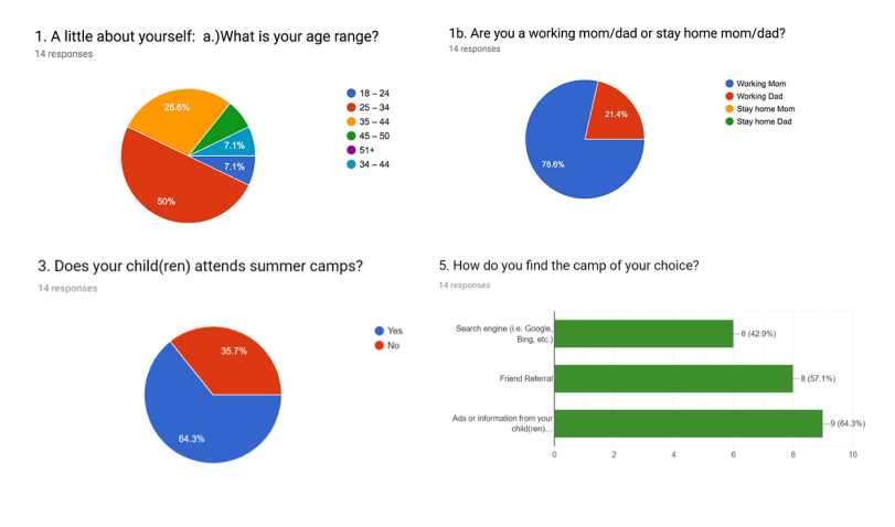
All participant's children attend summer camps.
2 out of 3 participants use search engines to find camps but can’t find enough content about the camps.
1 out of 3 participants relies on friend referrals.
1 out of 3 participants changes camps every year and he or she wants their older kids to be challenged academically during summertime.
2 out of 3 participants keep their children in the same camp until they outgrow the camp.
All 3 participants use the following factors to decide on a camp: location, pricing, and program/activities.
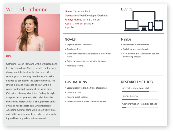
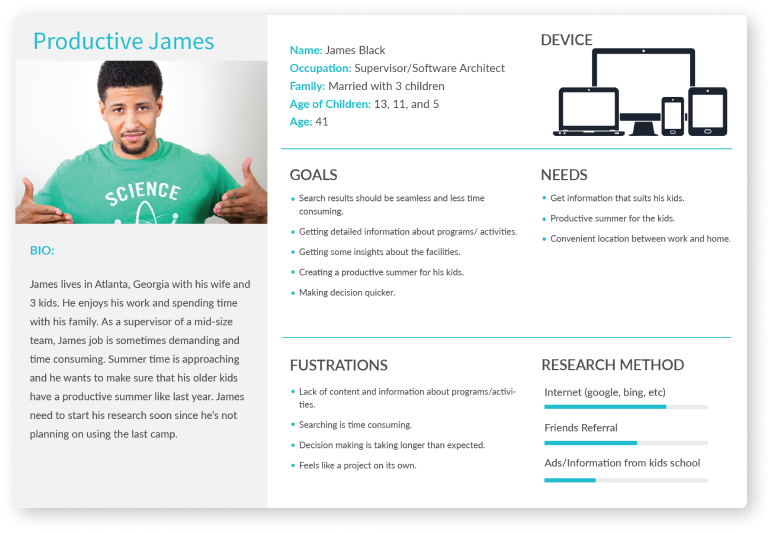
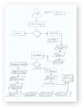
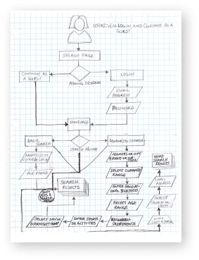
Each persona had a scenario that identified a realistic goal the user might have when using the web app.
The design decisions will focus on the goals and frustration of each persona and the interaction with the product.
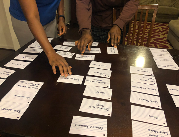
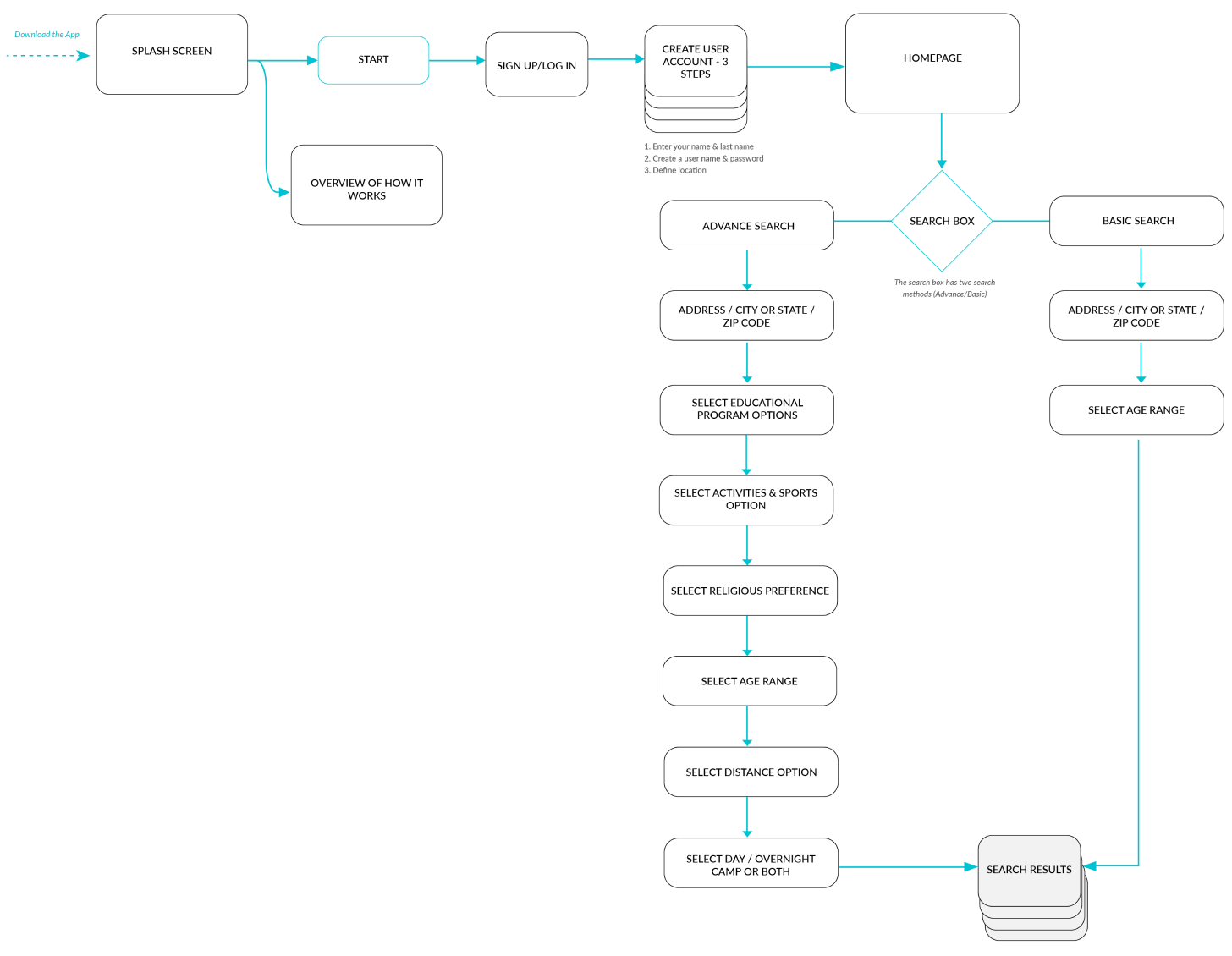
Since Camp Advizor is more of an informational product, the layout seems straightforward. While observing the users during the card sorting exercise confirmed that the structure and features were easy to understand through their groupings.
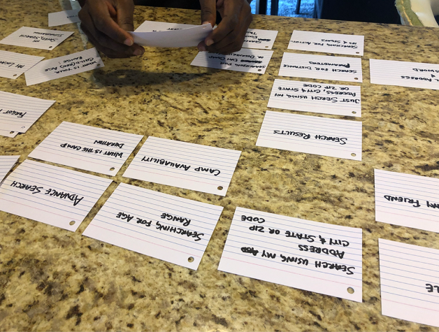
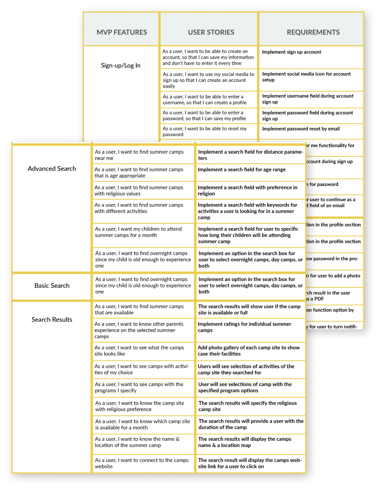
The main issue that my design decisions needed to solve was for the user to get enough information about different camps based on the functionality of the search box. This information is as follow:
Text field for location
Selection for distance and age range
Text field for educational programs
Text field for activities and sports
Option to select day or overnight camps
Option to select religious preference
As a user, I want to find summer camps for my six-year-old who loves playing soccer and swimming through camp advizor.
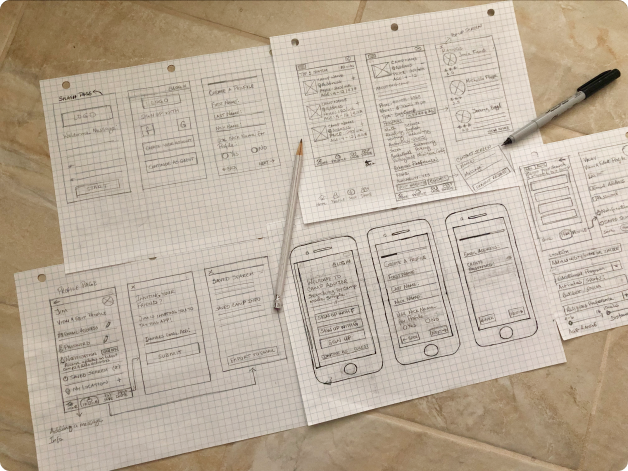

I turned my sketches into a black and white interactive prototype using Uxpin software. I tested the prototype in-person and remotely with users to understand how my solution would work.
3 total participants
1 male, 2 females
Ages range between 30-35
Sign up as a first-time user and search for summer camps for your 7-year-old kid who loves soccer and needs improvement with writing.
Overall the testing went well with users able to accomplish the tasks given without any issue. Some of the users were very forthcoming and had valuable ideas around some of the functionality within the app. One of the users had a question about the functionality of the map, which I’ll be iterating and testing to see what users are expecting from the map. This might be something I’ll look into later.
During the sign-up process, adding text field for zip codes on the location page.
The search result page will have field option to sort by price, ratings, or both.
Changing the functionality of the log out on the avatar to a dropdown with the option to log out when its clicked.
Adding a ‘remember me’ checkbox option for the login page for credentials to be saved.


The user survey helped uncover other users that were having the same problem as my sister-in-law Veronica. This information enabled me to create design solution that will solve the problem.
Focusing on the users’ needs and pain points helped me to create a seamless experience for the end-user.
Conducting user testing and evaluating users feedback helped me to discover which features work and the ones that needed adjustments. This process was very valuable and will help eliminate any frustration users might have when using this product.
